For every column chart that is done right, there are a dozen that get messed up. That is why lets talk about 5 simple rules for making awesome column charts.
Tip: Same rules apply for bar charts too.
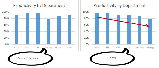
Rule #1: Start at zero
The first rule is simple. Always start your column charts at zero. When looking at column (or bar) charts, our mind measures height of each column and compares. So, if a column starts at some arbitrary point instead of zero, it can mess with our perception of how each column compares with other. Don’t believe me. See yourself.

Related: What is the most embarrassing charting mistake you made?
Rule #2: Thou shall sort
Sort your columns in a meaningful order. For example, sort them by descending order (of column heights), alphabetical order or chronological order. This will make reading the chart easy.
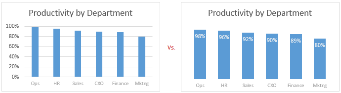
Rule #3: Slap a title on it
Give your chart a meaningful, clear title. Few examples of good and bad titles shown below.
 Rock star tip: Using smart titles & legends in your charts
Rule #4: Axis & Grid-lines vs. Labels
For most charts you can use data labels instead of axis & grid-lines. This will keep the chart clean.
If you choose to go with Axis and gridlines, then make sure they follow below guidelines.
- Axis label text should be relatively small & dull.
- Grid lines & axis line should be dull too.
- Do not display too many or too little major units on axis. You can change major unit size by selecting axis and pressing CTRL+1 (or axis options pane in Excel 2013).
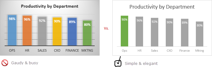
Rule #5: Too much lipstick and you have a pig
Make sure the formatting (colors, fonts, special effects, backgrounds etc.) of your chart are really subtle and meaningful. If you use too many colors, you end up with a pig. People will then focus on all these colors, fonts instead of actual data.
Few ways to add wow factor to your chart without messing it up:
- Highlight a particular column (for example max value, min value etc.) using different series technique.
- Use descriptive titles, clever data labels to show more information.
- Use drawing symbols or shapes to enhance the message of chart.
- Make your chart interactive to give users control.
- Add Emojis even
So there you go. Follow these rules and your column charts will stand tall.
Share your rules for making awesome column charts
While above rules capture the gist of making good looking column charts, there is more to learn and follow. So go ahead and share your rules and tips using comments. Teach us how you make stunning column charts (or bar charts). Post your comments below.
Make charts often? Check out these tips:
If your job involves analyzing & charting data, then check out below tips to learn more.
- 5 more rules to make better charts
- How to select right type of chart for any situation?
- 14 skills you need as a chart maker
- Never use simple numbers in your dashboards
- More charting principles & examples.
The post 5 simple rules for making awesome column charts appeared first on Chandoo.org – Learn Excel, Power BI & Charting Online.
Original source: http://feedproxy.google.com/~r/PointyHairedDilbert/~3/joXpD-PKpKw/