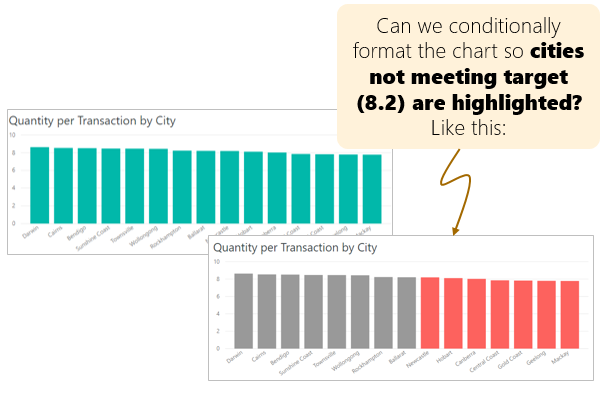
Do you know that you can apply conditional formatting rules to visuals in Power BI? In this post, let’s learn how to conditionally format visuals in Power BI. Something like this:
To conditional format charts in Power BI, follow below instructions.
- Select the visual you want to apply formatting rules.
- Go to Format pane and click on “Data colors”.
- When you hover on the label “Default color”, you notice three dots. Click on them to activate “Conditional format” screen.

- Here you can define a rule for coloring the chart. There are 3 types of conditional formats (as of writing this post in last week of July, 2019). They are,
- Color scales
- Rules
- Field value
Color scales:
As the name suggests, this will create a continuous color scale from minimum to maximum value. You can opt for diverging scale to include a midpoint color too. I am not a big fan of this for normal charts (although I do use it on tables / matrix visuals).
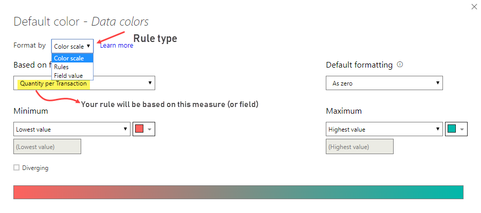
Rules:
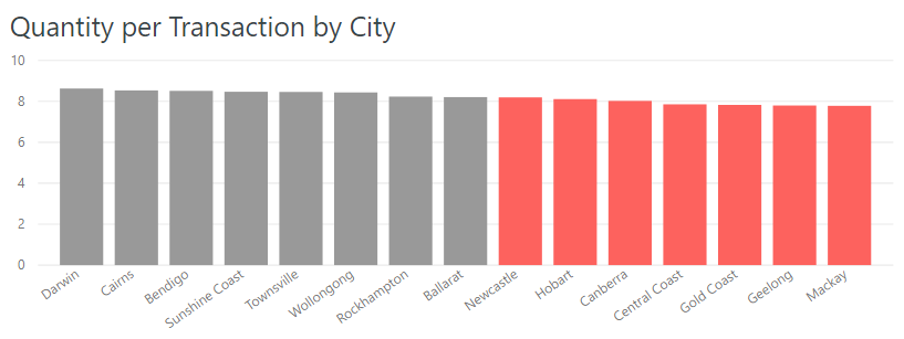
This gives you flexibility to define a rule based logic for coloring. You can write rules to color chart elements based on number or item rules. See this example to understand how to set up a rule to highlight all cities where “Quantity per Transaction” is less than 8.2 in different color.

This is how our final chart would look:
Field Value:
You can also write a measure (or have a table field) that returns HEX code (or RGB code) for the color you want to use for each chart element. If you have such a measure, you can use Field value based rules to set them. For example, you can create a measure like [Column Color] and link it.
[Column Color] = IF([Quantity per Transaction]>8.2, "#999999", "#c82222")
When you link this [Column Color] measure to the chart on Field value rule, your columns will be either of those colors (#999999 or #c82222) based on the [Quantity per Transaction] for each item in the chart.
How to make rules based on dynamic values?
As of now, the conditional formatting in Power BI only accepts rules based on fixed (hardcoded) values. But we can create an intermediate measure to overcome this limitation. For example, we can create a measure like this:
[Rule outcome for highlighting] = IF([Quantity per Transaction] > [QpT Target], 1, 0)
We can then use [Rule outcome for highlighting] in the rules and color based on the fixed values of 0 or 1.
How to conditionally format visuals in Power BI – Video tutorial
If you are still confused or need some guidance, please watch this 10 minute video. It explains all 3 types of conditional formatting with examples. Watch the video below or on our YouTube Channel.
Download Sample Workbook – Conditional formatting in Power BI
Please download the sample file for this tutorial here. You can see a demo of all three types of rules. Feel free to examine the data model, measures or create something on your own to learn how it all works.
Learn more about conditional formatting in Power BI:
Microsoft has been enhancing conditional formatting feature in Power BI over time. Just recently (in July 2019 release) they have launched support for icon rules (similar to Excel conditional formatting icons) for tables & matrix visuals. Learn more about conditional formatting in Power BI by reading Power BI docs.
More Power BI examples & tutorials:
- Getting Started: What is Power BI?
- Tip: Creating beautiful reports in Power BI – 5 tips
- Full example: Employee Turnover dashboard in Power BI
- Recommendation: Best books for learning Power BI
Do you use conditional formatting in Power BI?
I have been using CF more often in my Power BI training / work as it is a powerful way to highlight important information without cluttering your reports.
What about you? Have you toyed with conditional formatting in Power BI? Got any interesting tips to share? Please post them in the comments.
The post How to conditionally format visuals in Power BI? appeared first on Chandoo.org – Learn Excel, Power BI & Charting Online.
Original source: http://feedproxy.google.com/~r/PointyHairedDilbert/~3/zclnMRO0Ffw/