Written by Debra Dalgleish from Contextures Blog
If you have a couple of years of daily data in Excel, you can use a pivot chart to quickly compare that data, month by month, year over year. This short video shows how to compare annual data in Excel pivot chart.
Video: Compare Years in Pivot Chart
This video shows how to create a pivot table, and make a pivot chart that lets you compare two years of data.
Depending on your version of Excel, and your option settings, the dates might be grouped automatically, or they might not be.
There are written instructions below the video that show how to group, if necessary, and how to change your option settings.
Create a Pivot Table and Pivot Chart
In this example, there is a named Excel table with 2 years of data from service calls.
We’d like to compare the number of work orders completed each month, year over year.
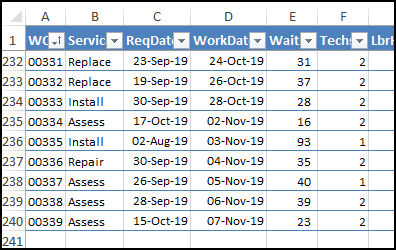
To create a pivot table and pivot chart,
- Select any cell in the work orders table
- On the Excel Ribbon, click the Insert tab
- In the Charts group, click Pivot Chart
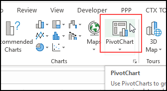
- In the Create PivotChart window, the table name (WorkOrders) should automatically appear in the Table/Range box
- Select a location for the pivot table
- You don’t need to check the box for “Add this data to the Data Model”
- Click OK

Add Order Count to Pivot Chart
After you click OK, an empty pivot table and pivot chart are added to your workbook.
At the right, in the PivotChart Fields list, right-click on WO, and add it to the Values area
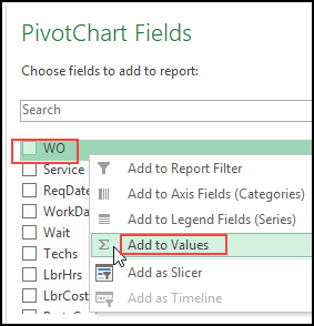
Because the Work Order codes are text, the value is summarized with a count of the orders. The WO count is also added to the pivot table
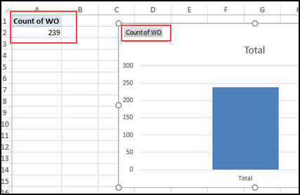
Add Work Date to Pivot Chart
Next, add a check mark to the WorkDate field, to add it to the pivot chart layout.
Excel will automatically add this date field to the Axis fields (Categories).
Depending on your Excel version, and your option settings, you might see
- all the dates listed individually (as shown in the video)
- OR just the years listed (in the screen shot below)
In Excel for Office 365, and the default option settings, my pivot chart shows the total work order count for each year.
There are instructions further down, that explain how to change that date grouping option.
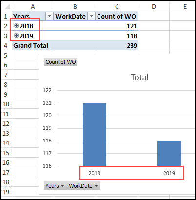
It also looks like this is a big difference between the years, but that’s because the vertical axis starts at 116, instead of zero. We can fix that later, if necessary.
Show the Months
If your pivot chart is showing the years, the next step is to show the months. (If all dates are showing, go to the next section)
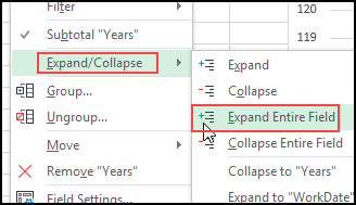
- In the pivot table (not the pivot chart), right-click on one of the years
- Point to the Expand/Collapse command
- Click on the Expand Entire Field command
Group Dates by Month and Year
If your pivot chart is showing individual dates, the next step is to fix the date grouping.
- In the pivot table (not the pivot chart), right-click on one of the dates
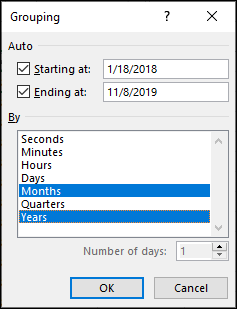
- Click the Group command
- In the Grouping window, the Starting at and Ending at boxes will show the first and last dates from the WorkDate field
- In the “By” list, click on Months and Years, then click OK
Change the Chart Type
The pivot chart now shows a bar for each month, from January 2018 to November 2019.
To compare year over year, we’ll change it to a line chart.
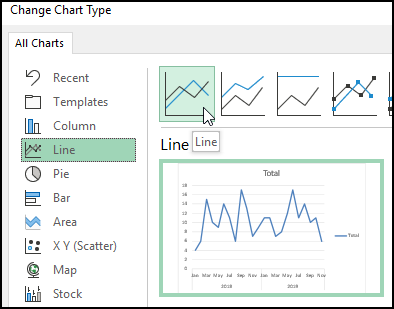
- Right-click on the pivot chart, and click the Change Chart Type command
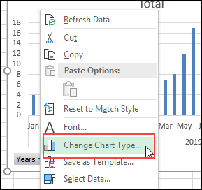
- In the list of chart types, click on Line
- Choose the first line chart option – Line, and click OK
Change to Year Over Year
The pivot chart now shows a line, but we want a separate line for each year, not a single line for the two-year time period.
You can do the next step in the Pivot Chart, or in the Pivot Table.
Pivot Chart
- Click on the pivot chart to select it
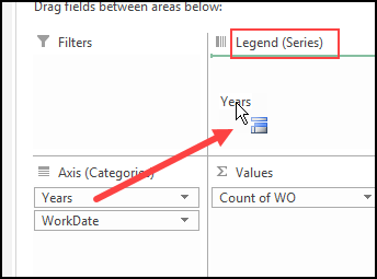
- In the PivotChart Fields List, drag the Years field into the Legend (Series) area.
Pivot Table
- Click on any cell in the pivot table
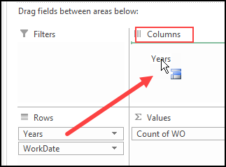
- In the PivotTable Fields List, drag the Years field into the Columns area.
Two Separate Lines in Pivot Chart
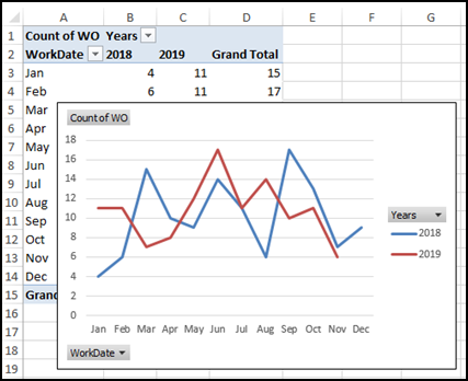
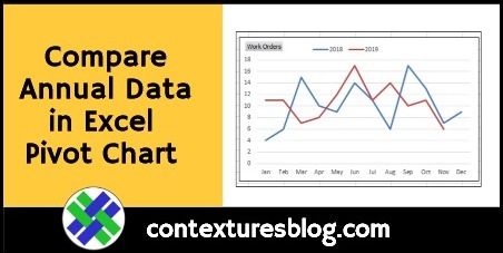
After you move the Years field, the pivot chart will show two separate lines – one for each year.
The pivot table layout also changes, with the years as column headings, across the top.
You can’t change a pivot chart, without affecting the pivot table that it’s based on.
Pivot Chart Formatting
After you have the pivot chart set up to show a separate line for each year, you can clean up the formatting, if you’d like to.
Here are a few suggestions:
Value Button: In the pivot table, change “Count of WO” to “Work Orders”, in the top left cell. That will change the label at the top left of the pivot chart.
Legend: In the pivot chart, right-click the Legend, and click Format Legend
- For the Legend position, choose Top, and uncheck the option to Show the legend without overlapping the chart
- Right-click on the Legend button, and click Hide Legend Field buttons on Chart
- Then, point to the Legend’s border, and drag the Legend to a new position, if necessary, so it doesn’t cover the lines
Axis Button: Right-click on the WorkDate button, and click Hide Axis Field buttons on Chart
Here’s the pivot chart, after making those changes.

Automatic Pivot Table Date Grouping
In Excel 2016 and later versions, when you create a Pivot Table, Excel automatically groups the dates into years and months.
If you’d prefer to see individual dates, follow these steps to change your Excel options.
NOTE: This is an application-level setting, and will affect all your Excel workbooks.
- On the Ribbon, click the File tab, then click Options
- Click the Data category, and at the end of the Data options section, add a check mark to “Disable automatic grouping of Date/Time columns in PivotTables”
- Click OK to apply the new settings.

Get the Pivot Chart Sample File
To get the workbook with the Work Order data, go to the Pivot Chart Compare Years page on my Contextures website.
The zipped file is in xlsx format, and does not contain any macros.
___________________
Compare Annual Data in Excel Pivot Chart

______________________
Compare Annual Data in Excel Pivot Chart is a post from Contextures Blog and is not allowed to be copied to other sites
Original source: https://contexturesblog.com/archives/2019/11/07/compare-annual-data-in-excel-pivot-chart/
