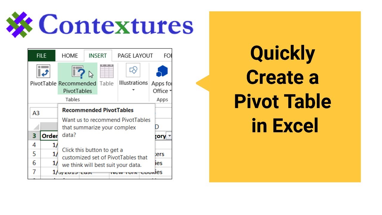
A pivot table is a quick and easy way to summarize data in Excel.
In Excel use the Recommended PivotTables tool, to see how easy it is to get started.
Watch this short video to see the steps for creating a pivot table, based on the suggested layouts.
Visit my Contextures website for the sample file and written steps.
http://www.contextures.com/CreatePivotTable.html
Instructor: Debra Dalgleish, Contextures Inc.
Get Debra’s weekly Excel tips: http://www.contextures.com/signup01
More Excel Tips and Tutorials: http://www.contextures.com/tiptech.html
Subscribe to Contextures YouTube: https://www.youtube.com/user/contextures?sub_confirmation=1
#ContexturesExcelTips
VIDEO TRANSCRIPT
A pivot table is a great way to summarize data in Excel. Here we have a table with sales records.
We can see where things were sold, what we sold, and how much and how much money we got on each sale. We can scroll down and see row after row of data.
Now I could create formulas to summarize things, but with a pivot table it will just be a few clicks to get totals. In Excel 2013 it’s easier than ever to create a pivot table because there’s a new tool to help you with some suggested arrangements for your data.
I’m going to click any cell in this table.
On the Insert tab, at the left, there’s a Tables group and here’s the new tool, which is Recommended Pivot Tables. I’ll click that.
It opens up a new window, and based on the data that I’ve got here, it’s suggesting some layouts
So the first one is showing the cities and then taking the total price and giving me the total sales in each city. That might be useful if I’m interested in where things are selling.
If we want to know what’s selling, here’s a layout that has the different product categories and then for each region how much we sold.
Below that, we can see those product categories again, and just the total price, instead of broken out by region.
You can scroll down, there are lots more options. If I go down further, we’re looking at the product categories and then the product names below that. This time it’s the quantity, rather than the price.
I’ll select that one. I’ll click OK, and it puts a new sheet in the workbook.
Here’s the layout that I selected. Now it’s got the quantity. I’m also going to add the total price. Over here, I can see all the fields from that data sheet.
I’ll click on total price. That puts another column here where the values are.
This one went in as Sum of Total Price. This one is Count of Quantity. If I go back and look at my data, I can see that going down the quantity column, there’s one item here that’s text rather than a number.
So Excel sees this not as a number column, but as either text or mixed numbers and text. So it defaults to Count. But we can change that.
I’ll just right click on one of those numbers, Summarize Values By, and instead of Count, I’ll click on Sum.
So now we can see the total quantity and the total price for each product category and product.
It’s a quick way to get started. You can change the layout after you’ve selected one of the sample layouts, but you’re up and running very quickly.
Watch this short video to see the steps for creating a pivot table, based on the suggested layouts.


